THE QUICK CHECK
An Evidence Based Investigation of Fact and Fiction
Since the 1990s we’ve been told that catastrophic climate change is happening because of carbon dioxide. Climate science has advanced in leaps and bounds. Scientists are making discoveries that question the greenhouse gases as the sole cause and even the leading cause of climate change.
IS THE CLIMATE REALLY CHANGING ? NASA defines climate change as a period of at least 30 years. Weather is what changes from day to day and year to year. The Sahara Desert wasn’t a desert 4,500 years ago. The light yellow area was grassland, the light green area was mixed woodland and grassland. The Fertile Crescent was cooler and greener than today’s arid land.
Courtesy of National Geographic, Volume 246.

A TIME LINE OF TEMPERATURE AND CARBON DIOXIDE CHANGE
• 10,000 years ago the world was 2 C (3.8 F) hotter than it is today and stayed hotter for the next 4,000 years. Carbon dioxide rose from 240 to 260 parts per million of air (ppm). There weren’t any man-made greenhouse gases.
• 6,000 years ago the temperature dropped to what we have today and stayed that way for the next 4,000 years. Carbon dioxide rose to 280 ppm.
• 2,000 years ago the temperature began a 1,500 year decline to the start of he Little Ice Age which began 550 years ago. Carbon dioxide levels stayed at 280 ppm.
• Carbon dioxide began to rise in 1750 CE. The temperature began to rise 80 years later which also marked the end of The Little Ice Age.
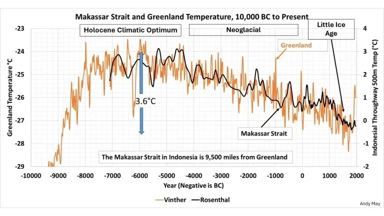
Dr. Vinther’s 12,000 Year Graph of six Greenland ice cores begins 11,500 years ago as the world emerged from the frigid Younger Dryas years. Zero on the vertical temperature axis is the 1880 to 1960 CE average temperature. The 2000 CE temperature at the right side of the graph is 1 C higher than that 80 year average temperature still but 1.5 C lower than the period shown as 8000 to 4000 BCE.

Dr. Rosenthal’s 12,000 Year Graph of the tropical Makassar Straight temperatures (black line) is overlaid on Dr. Vinther’s graph showing that changes in the Arctic and Tropics were global, not regional like the Medieval Warm.
• Both graphs show the 12,000 year time line as 10,000 BCE to 2000 CE.
• The earlier temperature lines show the average temperature for a century.
• The temperature at 0 on the time line changes 2.5 C (4.5 F) from one century to the next. That happens several time along the time line.
• Our current rise of 1.5 C since 1800 isn’t historically exceptional.
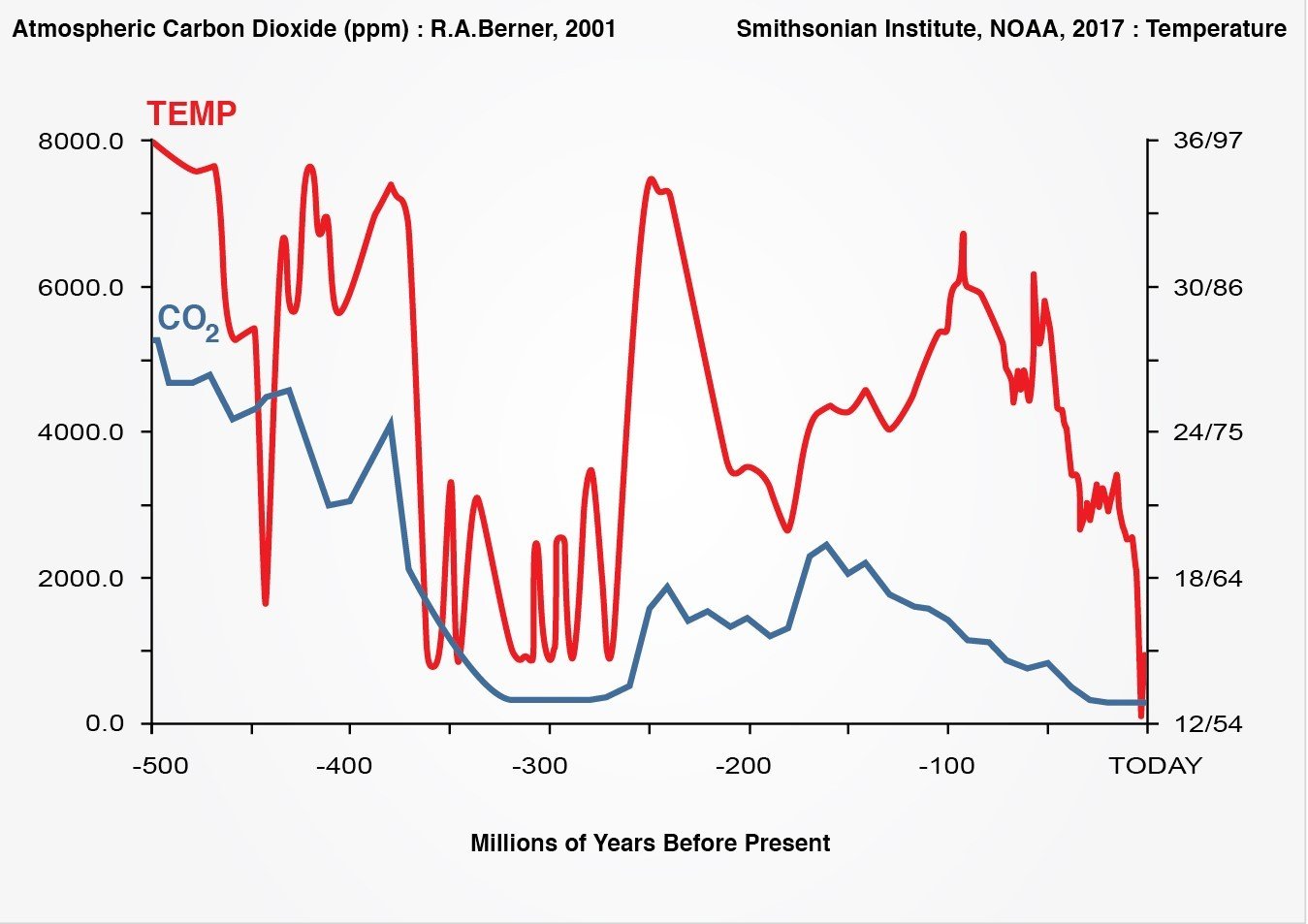
500 MILLION YEARS of accurate climate history shows that for most of the last 600 million years global temperatures were much hotter than today. The Arctic, Greenland and Antarctica were ice free (68 F, 21 C) most of the time. Today’s temperature (59 F, 15 C) at the bottom right side of the graph is far below the 150 million year average. The climate is always changing in geological time but usually creeping in our perspective of time.
THE CORRELATION FALLACY
Comparing the movement of lines on any graph only suggests a possible relationship.
Imagine a graph of hot dog sales at the beach and shark attacks. Summer weather brings people to the beach which leads to an increase in hot dog sales. Summer weather also brings warmer water temperatures which cause sharks to migrate northward and the inevitable shark attacks. This graph would show hot dog sales leading shark attacks - proof that hot dog sales cause shark attacks.
Mistaking the lines on a graph as proof of anything is called the Correlation Fallacy. It is the fundamental error made by all those who wanted so badly to find the cause of climate change that they mistook the lines on graphs like the one below and in An Inconvenient Truth as proof that carbon dioxide was causing climate change.
The 500 Million Year graph above shows temperature and carbon dioxide moving independently. That strongly suggests carbon dioxide does not cause temperature change. Yet the 800 thousand year graph of the ice ages below shows temperature and carbon dioxide moving together. Neither is a mistake. This graph is highly compressed. An in depth study of the underlying data found that carbon dioxide followed temperature by about 800 years. It’s impossible to see differences of 800 years in a graph this highly compressed.
National Climate Data Center, a division of NOAA
