THE DEEP DIVE
The Sahara Desert wasn’t a desert 4,500 years ago. The light yellow area was grassland, the light green area was mixed woodland and grassland. The Fertile Crescent was cooler and greener than today’s arid land.
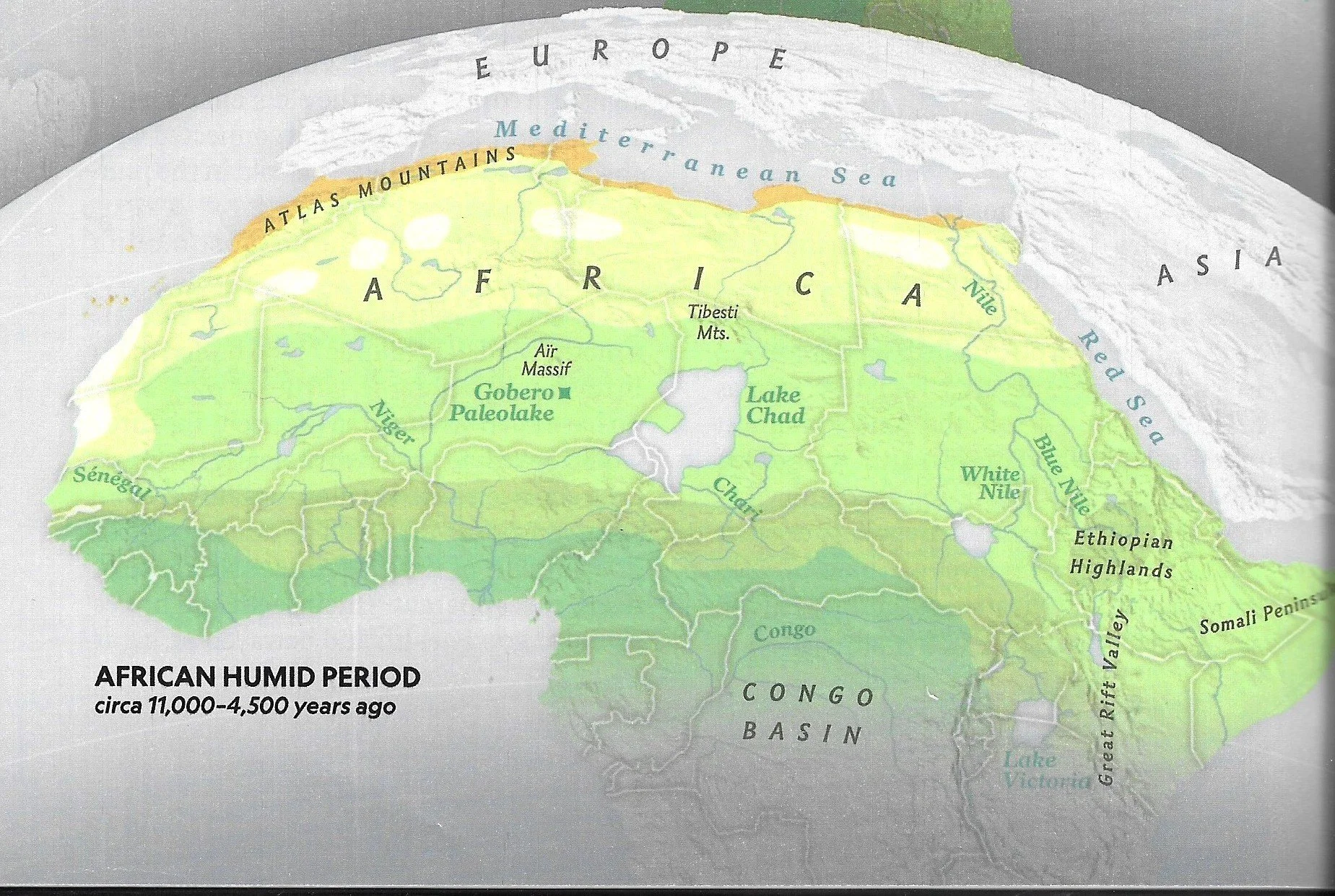
Courtesy of National Geographic, Volume 246
116,000 YEARS of CARBON DIOXIDE and CLIMATE CHANGE
116,000 years ago the most recent ice age began, freezing all of northern Europe, Russia and half of North America. Carbon dioxide sank to 180 parts per million (ppm).
20,000 years ago the world began a roller coaster of warming and chilling that ended after the Younger Dryas 11,500 years ago. Carbon dioxide rose from 180 ppm to 240 ppm.
6,000 to 10,000 years ago the world was 1.5 C (2.7 F) hotter than it is today (2020 - 2025) Carbon dioxide slowly rose to 260 ppm.
2,000 to 6,000 years ago the temperature dropped to what we have today. Carbon dioxide rose to 280 ppm.
2,000 years ago the temperature began a 1,500 year decline to the start of the Little Ice Age 550 years ago. Carbon dioxide levels stayed at 280 ppm.
Carbon dioxide began to rise in 1750 CE. Temperature didn’t begin to rise until 1830 CE.
That was the first time in 10,000 years that carbon dioxide led temperature. Even so, they did not rise at the same time and did not rise proportionally.
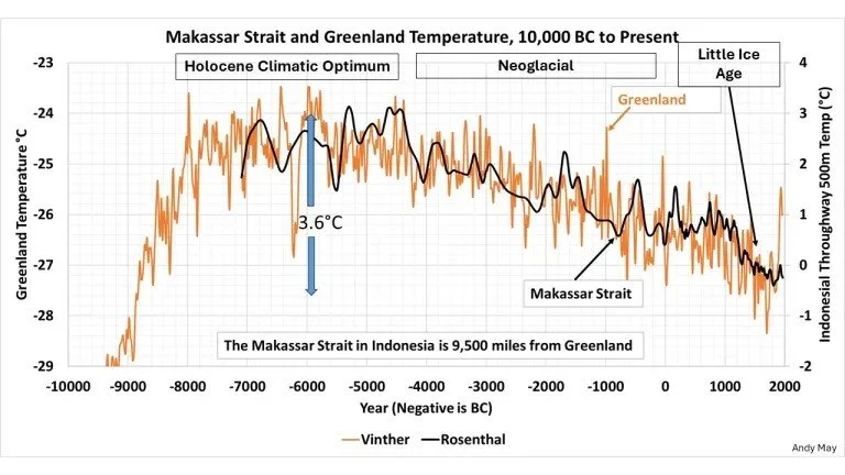
Dr. Vinther’s 12,000 Year Graph of six Greenland ice cores begins 11,500 years ago as the world emerged from the near ice age temperatures of the Younger Dryas period. Zero on the vertical temperature axis is the 1880 to 1960 CE average temperature. The 2000 CE temperature at the right side of the graph is 1 C (1.8 F) higher than the 80 year average but still 1.5 C (2.4 F) lower than the period shown as 8000 to 4000 BCE.
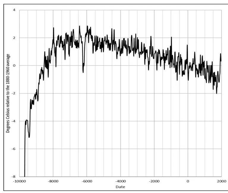
BAC II’s 10,000 Year Graph of the Baltic Region shows the same data line over the same time period as the Vinther graph above and the Rosenthal graph below. The red and black lines show moving averages. There were century long temperature peaks six to eight thousand years ago that were 3 C (5.4 F) higher than today. Perhaps our current rise of 1.5 C over two centuries isn’t historically exceptional.
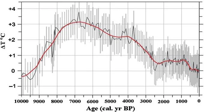
Dr. Rosenthal’s Graph 12,000 Year Graph of the Makassar Straight (tropical temperatures) overlayed his data (black line) on Dr. Vinther’s Greenland graph. The graph data lines show the same trend indicating the changing temperature were global.
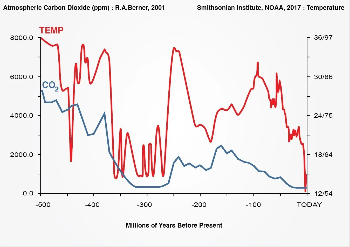
500 Million Years of climate history shows that earth’s greenhouse gases and temperature appear to move independently of each other. The graph is based on the carbon 14 isotope and oxygen 18 isotope both of which are created by solar radiation impacting the respective molecules in the ultra high thermosphere. The graph was created for this website overlaying Dr. Robert A. Berner’s carbon dioxide data on the Smithsonian Institute graph showing temperature data from NOAA.
Between 1940 and 1970 the global temperature fell while carbon dioxide continued its upward climb. Forster et.al. (2025) Figure 7. Dr. Forster is cited in the IPCC’s AR6.
WHY DO WE BELIEVE CARBON DIOXIDE IS CAUSING CLIMATE CHANGE
The early data analysis of the Greenland and Antarctic ice cores appeared to show carbon dioxide leading temperature. Al Gore championed it in his 2006 book An Inconvenient Truth and speaking tour. The media covered it, people began to accept it and politicians chased the votes. The climate appear to be changing and many accepted the mantra that carbon dioxide and the other greenhouse gases are the cause.
The idea was proposed in 1895 but languished until 1959 when Dr. Roger Revelle, a highly respected oceanographic scientist, said it might be possible in the scientific journal Tellus (Volume 9, Issue 1, Page 27). That it might be possible wasn’t proof. Climate scientists continued searching for the cause climate change. When the early Greenland and Antarctic ice core data graphs appeared to show carbon dioxide and temperature moving together, it was the eureka moment. Those who wanted to see carbon dioxide leading temperature jumped on it. Unfortunately, they ignored the Correlation Fallacy. And they weren’t concerned that Ice Ages are a time of extreme climate with half of the northern hemisphere, one third of earth’s total land mass, completely frozen. The world’s oceans dropped 130 m (420 ft). Everywhere north of the tropics was far colder than today greatly inhibiting plant growth and the carbon cycle. Cooling oceans absorbed atmospheric carbon dioxide dropping it to just 180 parts per million.
THE CORRELATION FALLACY
When two lines on a graph appear to move together (or opposite) it’s a correlation - only a suggestion that there may be a relationship. Mistaking a correlation as proof of a relationship is called the Correlation Fallacy, a fundamental mistake. Many of the scientific community’s carbon dioxide advocates forgot about the Correlation Fallacy.
A second contradiction is that in a sole cause relationship the leading (independent) variable must always cause the following (dependent) variable to change in the same direction, at the same time (or time lag) and same proportionate amount of change as the leading variable. The greenhouse gases fail in each of these criteria showing that humanity’s greenhouse gases cannot be the sole cause of climate change.
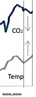
An Inconvenient Truth’s 600,000 year graph compresses time into a very short line. This expanded part of the graph at the 500,000 year mark is one example showing:
Carbon dioxide drops at the left edge while temperature rises and then fails to rise proportionally with temperature for about 35,000 years.
As shown by the arrows to the right, temperature rises while carbon dioxide falls for about 13,000 years.
These data inconsistencies say there must be more factors influencing climate change.
The next graph shows an 800,000 year progression of ice ages and interglacial warm periods. Zero is the 1880 - 1960 average temperature:
The carbon dioxide and temperature lines move together as they would in a highly compressed time line where 1,000 years are a hair’s width.
The overlaid presentation of this graph makes it much easier to see the differences between CO2 and Temperature than the An Inconvenient Truth’s split level graph.
Carbon dioxide was 180 ppm during the last ice age (far right). It spiked above 280 ppm in each of the four major peaks between 100,000 and 400,000 years ago without any human generated greenhouse gases.
The temperature was hotter than today for thousands of years during each spike.
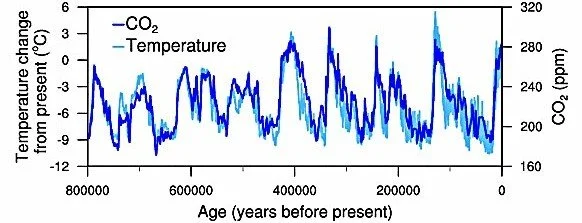
Jouzel et al, 2007; Luthi et al, 2008 : NOAA National Centers For Environmental Information
WHAT ARE CLIMATE SCIENTISTS SAYING NOW?
Rather than carbon dioxide leading temperature, detailed analysis of the ice core data by climate scientists has found that it is temperature that leads carbon dioxide.
Dr. Caillon’s (2003) detailed analysis found that temperature leads carbon dioxide.
“CO2 increase lagged Antarctic deglacial warming by 800 +/- 200 years”.
https://pubmed.ncbi.nlm.nih.gov/12637743/
Dr. Florides (2008) summarized the work of his team saying:
“Temperature rises first, followed by an increase in atmospheric CO2.” Global Warming and Carbon Dioxide Through Sciences, Research Gate:
DOI: 10.1126/science.1078758
Dr. James Lovelock, a highly respected scientist, early carbon dioxide advocate and author of The Revenge of Gaia (2006) did something in 2014 scientists rarely do. He reversed his carbon dioxide advocacy saying it was a mistake to say carbon dioxide controls temperature.
“We're no longer in a position to say that just because carbon dioxide rises … the temperature will rise likewise.”
How could Dr. Lovelock and so many climate scientists have gotten it wrong? He said:
“We were carried away by the (correlation of) the ice cores of Antarctica.” The quotes are from the Toronto Globe and Mail, Nelles interview, July 11, 2014.
IS THE CURRENT CLIMATE CHANGE CATASTROPHIC ?
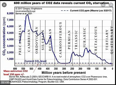
Dr. Wrightstone’s 600 Million Year Graph shows the Triassic and Jurassic Eras. Carbon dioxide levels were four to five times higher than today. The fossil records show that dinosaurs thrived. Plants thrived. Coral, clams and shell fish thrived in higher ocean temperatures. The oceans did not become acidic because of the higher temperatures and the much higher levels of atmospheric carbon dioxide. https://doi.org/10.1016/S0016-7878(59)80068-7
Note the “Current CO2 level” dotted line near the bottom of the graph and the thin black line just below it titled “Mass extinction level 150 ppm” (parts per million) of air for plants.
PLANTS Carbon dioxide is for plants what oxygen is for us. When carbon dioxide levels plunged during the ice ages to 180 ppm (parts per million) it was starvation level for plants. Plants thrive in higher levels of carbon dioxide. Their ideal level is four times higher than today’s so-called catastrophic level of 420 ppm. Many greenhouses operate at levels carbon dioxide two to three times higher than 420 ppm. Workers do not require special breathing apparatus in those enriched carbon dioxide environments. Carbon dioxide does not become toxic until it displaces oxygen which would require more than 20,000 ppm.
Dr. Patrick Moore (a Greenpeace Co-founder) Should We Celebrate Carbon Dioxide
The Global Warming Policy Foundation https//www.thegwpf.org
Anran Wang, et al., Zhejiang University, Hangzhou, China
CO2 enrichment in greenhouse production: Towards a sustainable approach.
Rising levels of carbon dioxide make plants more productive which is helping feed our ever increasing global population. We also benefit by more productive plants consuming more carbon dioxide per plant and producing more oxygen. “From a quarter to half of Earth’s vegetated lands have shown significant greening over the last 35 years largely due to rising levels of atmospheric carbon dioxide ...” NASA
THE OCEAN Is runaway, catastrophic global heating really in our future?
Graphs by climate scientists at Berkeley Earth show that atmospheric temperatures have risen 1.5 C (2.7 F) since 1830 CE. That date was also the end of The Little Ice Age.
The upper ocean level (200 m, 660 ft) temperature has only risen 1 C (1.8 F).
Most of the vast, deeper ocean (3,650 m, 12,500 ft) has remained at 4 C (39 F).
NASA scientists says the ocean capture 93% of the atmosphere’s excess heat. The United Nations (un.org) agrees. How much heat absorbing capacity do the oceans have? Dr. Lovelock said: “The ocean’s heat capacity is about 1,000 times greater than that of the land and atmosphere”. (Nelles interview as cited above.)
CLIMATE MODELLING
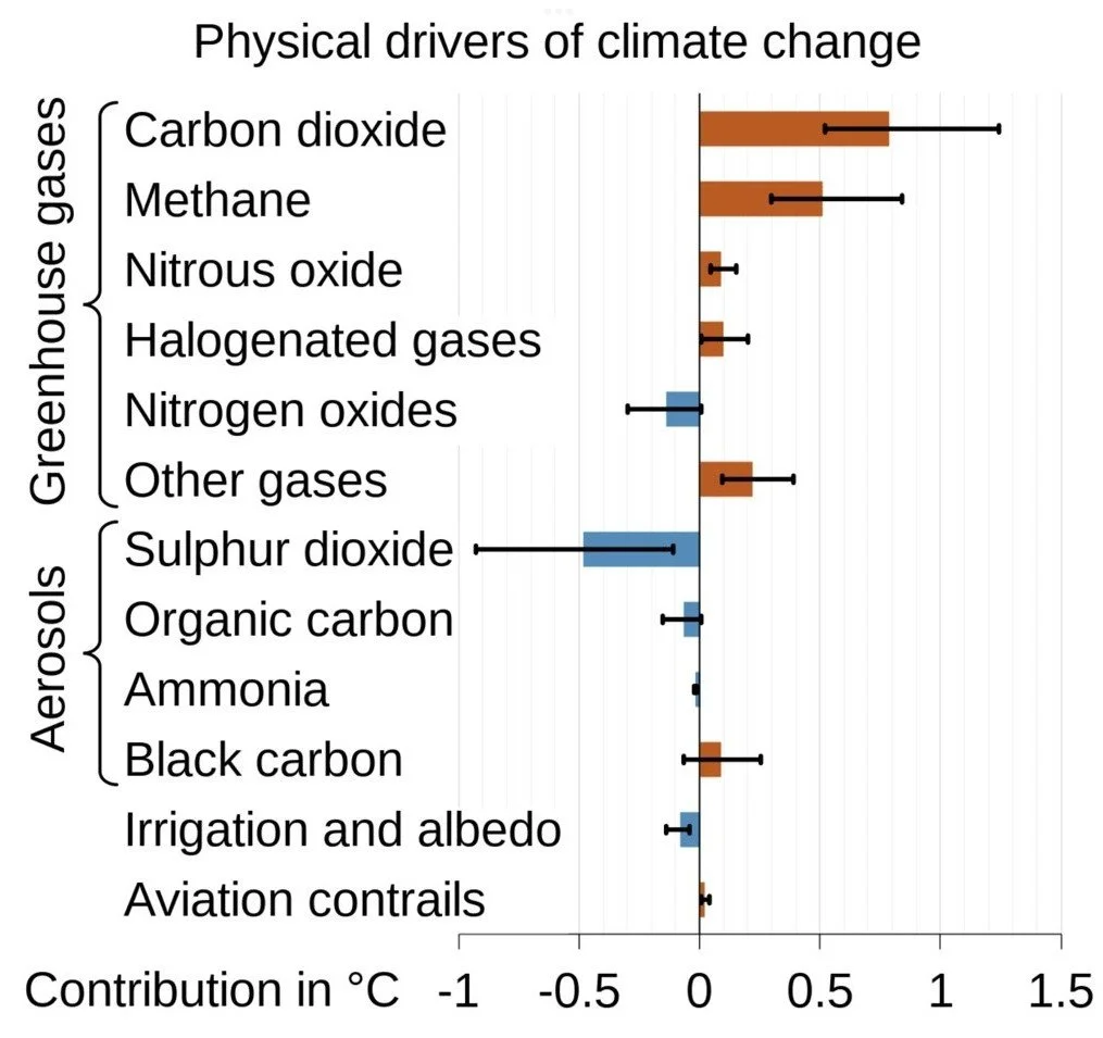
In its AR6, WG1 the Intergovernmental Panel on Climate Change (IPCC) shows a lateral view of a greenhouse gases chart. The color bars show the IPCC’s average atmospheric warming estimate compared to carbon dioxide for each gas. The black bars show the large range of expert estimates (uncertainty) for each element which is typically more than 50%. Large uncertainty ranges severely reduce the accuracy of climate modelling.
Carbon dioxide is the radiative forcing standard that all other GHGs are rated by.
GASES: 5 heat (orange)
1 cools (blue)
AEROSOLS: 3 cool
1 heats
The cooling aerosols and gases (blue) cancel all of the smaller heating gases (orange) leaving only carbon dioxide’s 425 ppm and methane’s 2 ppm. Therefore greenhouse gas discussions are really about carbon dioxide and methane.
CLIMATE MODELLING PROBLEMS
All modelling “output is only as reliable as accuracy and completeness of the modeller’s input. All models are built on assumptions, and even the most detailed ones can’t capture how the world actually works”. (Steven Poloz, Governor, Bank of Canada, 2013 - 2020)
Science is based on facts proven by research. Modelling runs our limited current knowledge through computer simulations in an attempt to predict future outcomes. That’s guessing. And it becomes harmful when used to influence government policies and spending.
The IPCC says: “In climate research and modelling, we should recognize that we are dealing with a coupled non-linear chaotic system, and therefore that the long-term prediction of future climate states is not possible.” The IPCC promptly ignores their statement and makes long term predictions it calls Global Warming Potential (GWP) for all human generated greenhouse gases.
Dr. Patrick Moore said, “The only trends the computer models seem able to predict accurately are ones that have already occurred.” Should We Celebrate Carbon Dioxide
Many climate scientists are questioning the U.N.’s IPCC climate prediction models. Go to scholar.google.com and paste “criticism of IPCC modelling” in the search window.
CARBON DIOXIDE TOTAL GLOBAL EMISSIONS for 2022 in gigatons (Gt.)
Total Emissions 889 Gt.
All Natural sources 848 Gt. 95.4%
All Human Sources 41 Gt. 4.6%
Fossil Fuels 38 Gt. 4.3% including gasoline engines.
Gasoline Engines 9 Gt. 1.0%
Springer, 2022 Data; IEA, Global Energy Review 2025, p.31; CoPilot
METHANE
Quick Facts: Methane’s greenhouse gas effect has long been rated at 20 times carbon dioxide. A few researchers suggest rates as high as 80 times greater than carbon dioxide. It’s currently 1,939 parts per billion in the atmosphere, increasing by about 10 parts per billion annually. 1,939 ppb rounds up to 2 parts per million. The long accepted atmospheric life time of a molecule is 8.2 years, typically breaking down into one carbon dioxide molecule and two water vapor molecules. The current carbon dioxide atmospheric count is 425 parts per million molecules of air. Adding 2 molecules to 425 molecules is science but it doesn’t grab headlines.
THE IPCC also rated the greenhouse gas effect of methane at 20 times carbon dioxide for 25 years, from its inception in 1988 to its 5th Assessment Report in 2013. That changed in Assessment Report 6, The Physical Basis (2021) when the atmospheric life of a methane molecule jumped from 8.2 to 12 years (40%). That bumped its GWP from 20 to 28 times carbon dioxide. It justifies the dramatic increase by saying the two molecules of carbon dioxide came from methane so their GWP should be added back to methane’s GWP. Atmospheric carbon dioxide comes from many sources. Charging the GWP of 2 molecules of carbon dioxide back to methane definitely grabbed headlines but that’s politics, not science.
Atmospheric methane doubled over the last two hundred years. The IPCC says approximately 40% of methane is created by nature and 60% humanity. Rice cultivation accounts for 30% to 50% of humanity’s input. About 1/3rd of rice cultivation is on converted wet lands, a major contributor to nature’s input. Following the IPCC charge back reasoning, charging 1/3rd of converted wetlands from humanity to back to nature re-balances the nature/ humanity inputs to 50/ 50. While methane has doubled, our population has doubled, doubled and doubled again during the last two hundred years. Our population is expected to increase by two billion in 2050.
HUMIDITY
The Troposphere is the lowest level of the atmosphere containing 99.9% of the atmosphere’s water vapor, droplets or ice crystals. The troposphere rises 18 km (11 miles) within 30 degrees of the sun’s zenith covering 50% of earth’s surface. Humidity decreases as the troposphere’s altitude slopes to about 6 km (4 mi.) in the polar regions. (diagrams)
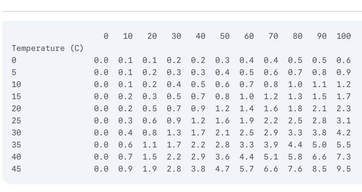
Atmospheric Water Vapor known to most of us as humidity, is unique among the greenhouse gases because it only exists in quantity in the troposphere. It contains 38,000 ppm (3.8%) of water vapor at 30 C (86 F) and 90% relative humidity, typical in the tropics and summer conditions in the world’s humid mid latitude regions. With the Global Warming Potential of carbon dioxide plus methane at 500 ppm, humidity’s 38,000 ppm GWP is 78 times higher.
Higher temperatures and humidity can raise water vapor to 70,000 ppm.
The table converts relative humidity to absolute humidity, the amount of water vapor in the air. With an air temperature of 20 C (68 F) and relative humidity of 50%, the absolute humidity shown on the chart is 1.0 = 1% = 10,000 ppm
Table created by Gemini for this website.
Why Isn’t Humidity Included In The Greenhouse Gases Conversation
The 1980s preliminary data from the Antarctic ice cores was misinterpreted as showing carbon dioxide leading temperature change. Governments were alarmed and directed the United Nations to establish the IPCC with a mission to investigate human generated carbon dioxide (only) as the cause of climate change. That mission morphed into all human generated greenhouse gases while ignoring the many natural causes of climate change that have always affected the earth’s climate and always will.
The IPCC acknowledges humidity as an important GHG but continues its exclusive focus on human generated greenhouse gases in part because of its mandate and in part because “humidity levels are more variable and influenced by natural processes”. The IPCC is deliberately ignoring earth’s natural forces. How can the IPCC be relevant when it is seeing only part of the climate change picture?
The IPCC also says humanity’s greenhouse gases are temperature’s accelerator, humidity only amplifies their heat. That statement is contradicted by historical temperature-carbon dioxide data. Their focus on humanity’s atmospheric trace gases ignores the elephant in the room.
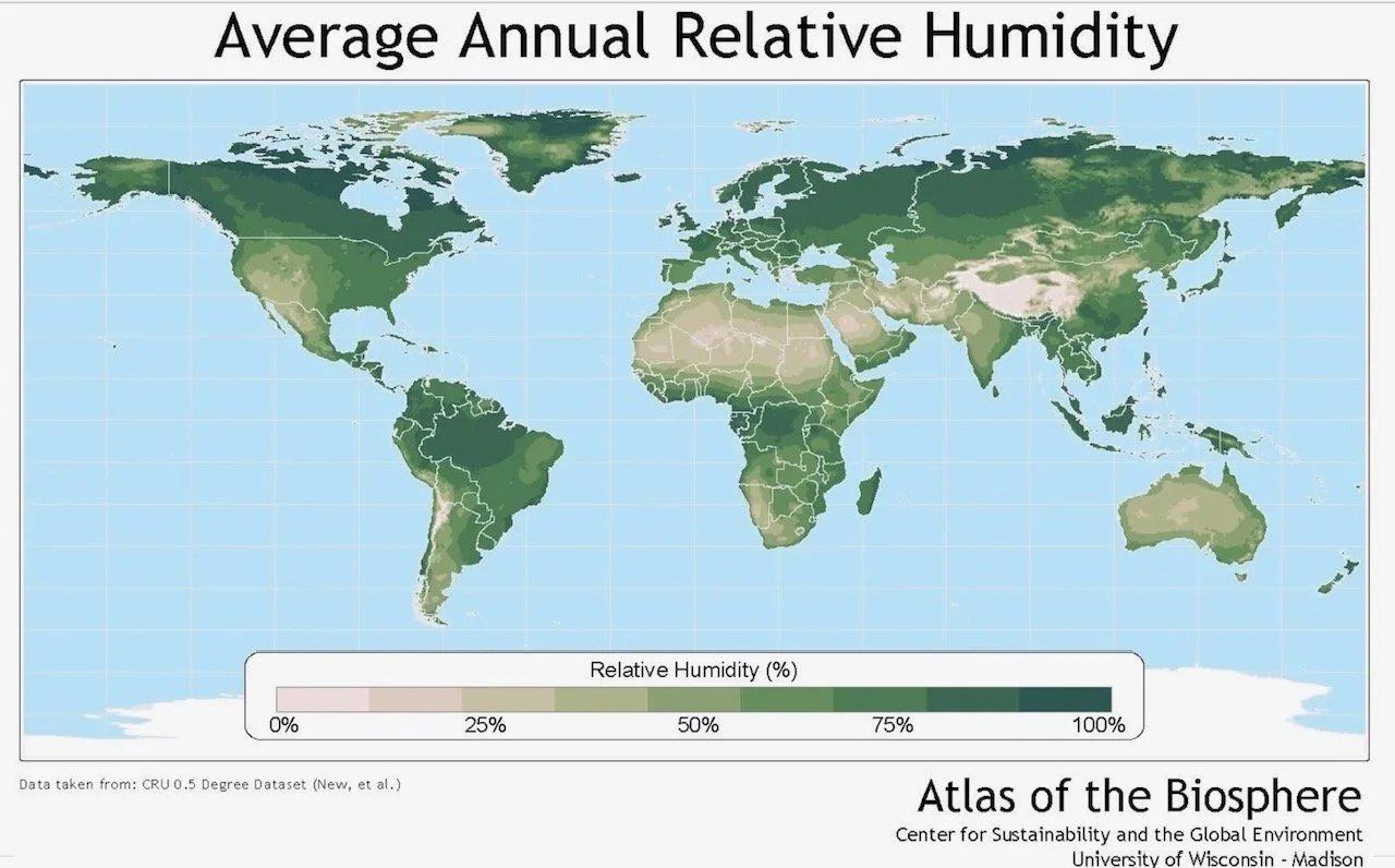
The MIT Climate Portal says it’s because a water vapor molecule’s time in the atmosphere is only days or weeks. With 50% of earth’s surface always within the band of the sun’s zenith and 70% covered by ocean, high amounts of humidity are a constant. True, there is a vast difference between the humidity levels in the Congo and the Sahara and other jungle-desert regions as shown in the image above but that is easily averaged. Humidity’s constant daily volume more than offsets its brief duration.
Comparing molecules, a water vapor molecule captures 2.3 times more heat energy than a carbon dioxide molecule.
While humidity only exists in the troposphere, the troposphere holds 75 - 80 % of earth’s atmosphere.
Dare it be said that humidity’s dominance diminishes the importance of the carbon dioxide - methane narrative.
THE GREENHOUSE GASES ARE WHAT GETS HEATED
continued …
RADIATIVE FORCING IS HOW THEY GET HEATED
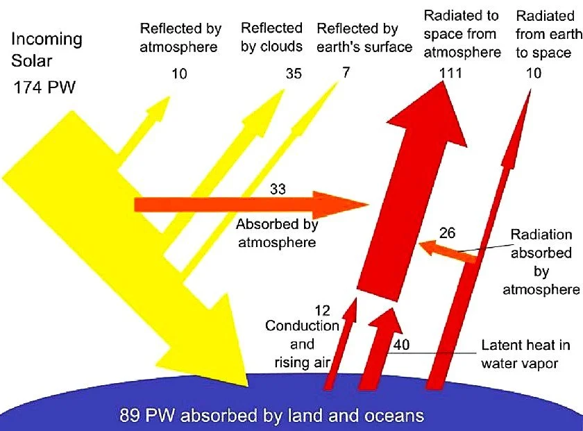
Graph by Frank van Mierlo : PW is a petawatt, one billion million watts of energy.
The sun’s short wave energy heats land and sea. 75% of the solar energy hits earth within the 30 degrees of where the sun is directly overhead. 90% hits within 40 degrees of that latitude. That energy envelope shifts northward and southward following earth’s annual tilt on its axis. See Milankovitch Cycles below.
Everything on land that doesn’t reflect or absorb solar energy will radiate excess heat as long wave energy. That’s what heats the greenhouse gases, a process referred to as Radiative Forcing. The greenhouse gases, overwhelmingly dominated by humidity, are a secondary planet warmer. Moving at the speed of light, atmospheric heat energy works its way up through the greenhouse gases and eventually out of the atmosphere. Radiative Forcing and Earth’s Energy Balance are explained in a NASA Tutorial from 2009.
How dominant is humidity compared to carbon dioxide and methane? Water vapor’s red broad spectrum absorption ability of short wave (left) and long wave radiation (right) is compared to carbon dioxide’s limited blue absorption bands as shown in this 2021 graph. Short wave to long wave radiation is shown from left to right.
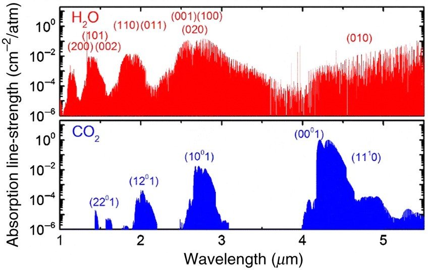
Dr. G. Yu (DOI: 10.1117/1.OE.60.10.104103)
The IPCC acknowledges that “Water vapour is the most abundant radiatively active gas ...”. (The Physical Science Basis 2021, Section 1.3.3, Page 179).
Accepting atmospheric methane’s 2 ppm as 28 times more potent than carbon dioxide makes methane the equivalent to 56 ppm of carbon dioxide. For ease of calculation, their radiative forcing values are added and rounded up to 500 ppm. Some sources claim methane’s radiative forcing value is 40 times greater than carbon dioxide which also equals 500 ppm of CO2 without rounding.
At 38,000 ppm of air, water vapor is 76 times (38,000/500) greater than carbon dioxide and methane together - no modelling involved. When the calculation is adjusted to recognize that a water molecule has 2.3 time greater heat energy capture capacity than carbon dioxide, the total jumps to 175 times. That figure is subject to adjustment due to other factors beyond the scope of this website. When all is said and done, it is by far the dominant greenhouse gas.
EARTH’S ENERGY BALANCE
Our planet’s atmospheric circulation follows the Second Law of Thermodynamics, moving heat energy from the tropics toward the polar regions. Heat energy escapes the planet through two primary mechanisms.
THERMAL COLUMNS Air pressure decreases with altitude causing the greenhouse gases to thin with the density if air. Altitude reduces all of the greenhouse gases are reduced by 75% at 5 mi (9 km). is likewise reduced facilitating the escape of heat energy into space.
EVAPORATION – CONDENSATION The sun’s short wave radiation heats the upper layer of the oceans (200 m, 660 ft). When water temperature exceeds air temperature, water evaporates. Long wave radiative energy that hits water is completely absorbed within a hair’s width of the surface, heating and likewise causing evaporation when air temperature is exceeded. Counter intuitively, warm moist air is less dense and rises releasing energy. Water vapor releases energy as it condenses into water droplets forming clouds. We take the energy in a raindrop for granted. Consider the amount of energy required to raise a cubic metre/ yard of water to cloud level.
Humanity’s additional greenhouse gases are said to be overloading earth’s energy balance causing global warming. The planet is warming. Humanity’s greenhouse gases are increasing. That’s a correlation. Where is the independent-dependent variable scientific evidence? Just because the IPCC says something, does that make it true?
Earth’s energy was balanced 6,000 to 10,000 years ago when world was hotter than today. Carbon dioxide was just over half of today’s level.
Earth’s energy was balanced 12,700 to 11,500 years ago during the abrupt 1,200 year plunge to near ice age temperature and rebounded. Carbon dioxide was less than half of today’s level throughout that climatic episode.
The IPCC would do well to include natural forces and eons of historical data.
RADIATIVE COOLING
Beyond thermals dissipating energy in the upper troposphere lay the physics of the Stefan – Boltzmann Law and the Planck Response.
Stefan-Boltzmann Law - hotter objects emit more radiation.
Planck Response - infrared radiation increases as surface temperature rises.
As earth warms, exponentially more energy is radiated into the atmosphere ultimately escaping earth and counteracting the rising temperatures.
“The amount of heat a surface radiates is proportional to the fourth power of its temperature. If temperature doubles, radiated energy increases by a factor of 16 (2 to the 4th power). If the temperature of the Earth rises, the planet rapidly emits an increasing amount of heat to space”. NASA
In Plain English: Increasing temperatures cause the release of heat energy to increase geometrically; not by squaring, not by cubing - but by quadrupling.
NATURES’ FORCES AFFECTING CLIMATE CHANGE
Nature has been changing the climate since the world began without any help from mankind’s greenhouse gases. One of the many ways is a theory developed a century ago by ground breaking structural engineer turned astrophysicist Dr. Milutin Milankovitch.
Dr. Milankovitch formulated three theories:
• Orbital Eccentricity: Earth’s orbit around the sun changes from round (warmer) to oval (cooler) in 100,000 year cycles.
• Axial Obliquity: How far the earth’s hemispheres tilt toward and away from the sun between summer and winter varies in 41,000 year cycles.
• Axial Precession: The earth also leans like a wobbling top swinging the polar regions toward and away from the sun in a 26,000 year circle. It’s currently warming the southern hemisphere more in its summer than the northern hemisphere in its summer. It’s about to reverse but will take thousands of years to give more summer warmth to the northern hemisphere. Images courtesy of NASA.
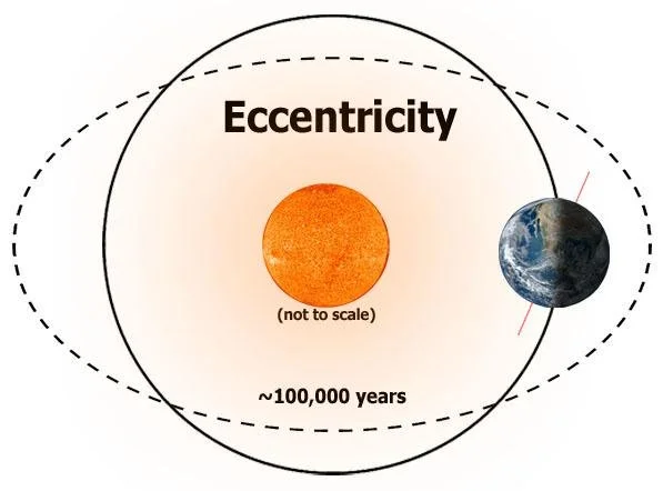
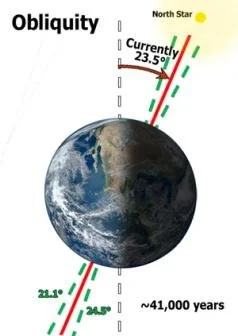

Highly accurate technology and computing power have confirmed Dr. Milankovic’s theories. Climate scientists have noticed a loose correlation between cooling alignments and the ice ages of the last two and a half million years. Research is investigating how much these three factors can heat and cool earth’s climate. Yet the Milankovic Cycles have been in motion for hundreds of millions, if not billions, of years. Why has earth’s climate been so much cooler for the last two and a half million years?
Dr. Patterson’s research found that the sun’s decadal, century and millennial solar cycles together with galactic cosmic rays effected the amount of cloud cover directly effecting global temperature. He also referenced Dr Veizer’s position that atmospheric water vapor is by far the dominate factor in our climate.
CASSIOPEIA - HD 7977
Recent astrophysics research found that a star of the Cassiopeia Constellation passed close enough to our solar system 2.8 million years ago to disturb the orbits of our giant outer planets. Their orbital wobbles in turn disturbed earth’s orbit. This occurred shortly before the start of the current progression of ice ages and interglacial warm periods (including the one we live in). Did earth’s orbit return to its pre-Cassiopea fly-pass pattern or has its orbit been permanently affected? The discovery of the Cassiopeia star’s fly-by has changed a long held belief by astrophysicists that our solar system was not influenced by other stars. More climate related astronomical discoveries are likely. Astrophysical Journal Letters, Kaib, et al.
Digressing for a moment - Mars shows evidence of once having liquid water, some of which may now be an ice cap under it’s north pole. Mars is smaller than earth and closer to Saturn, Jupiter and Uranus. It’s solar orbit would have been more affected by Cassiopeia than earth’s solar orbit. What effect did it have on Mars. Has Mar’s solar orbit recovered?
EL NIÑO SOUTHERN OSCILLATION (The El Niño - La Niña Phenomenon)
Under normal conditions, trade winds blow west along the equator in the Pacific Ocean, where it moves warm water from South America towards Asia. Cold water rises from the deep ocean to replace that warm water. During an El Niño, that process reverses the trade winds pushing warm water toward South America. These wind reversals are not permanent. Negative feed backs act to cool the eastern Pacific and restore the normal wind pattern. The wind reversal is a powerful but temporary state within the ENSO cycle affecting the weather of North America and Europe.
The El Niño winds blow the tops of hurricanes as they form in equatorial Atlantic Ocean causing upper ocean heat to build up affecting the weather patterns of North America and Europe. This is the phenomena that enabled the Conquistadors in Central America to reach the Incas. Research found evidence that ENSO cycles have been happening for 5,000 years. Recent research found they go much further back: "ENSO has been a leading mode of tropical sea surface temperature (SST) variability in the past 250 Million years”. The Atlantic and Southern Meridontal Overturning Circulations are two more oscillating systems like ENSO that effect global weather.
POLAR MOVEMENT
Another interesting relationship is the correlation between climate change and the movement of earth’s magnetic north pole. In 200 AD (red dot upper left) earth’s magnetic north pole was located on the coast of Siberia. The middle east was referred to as The Fertile Crescent, then a green and temperate region. By 750 AD the magnetic north pole had moved to the northern tip of Canada’s Baffin Island. The middle east had become hotter and dryer. In 1,000 AD the magnetic north pole was at the geographic north pole. Europe and some other parts of the world were experiencing the Medieval Warm. By 1,500 the magnetic north pole was in the Arctic Ocean slowly migrating to Canada’s northern coast. The Little Ice Age had begun. The magnetic north pole stayed near Canada’s north shore until fifty years ago when it began to move rapidly north and west toward Siberia. Now it’s closer to Siberia than Canada again and the world is warming. Fertile Crescent Reference: https://doi.org/10.1126/science.abg4044
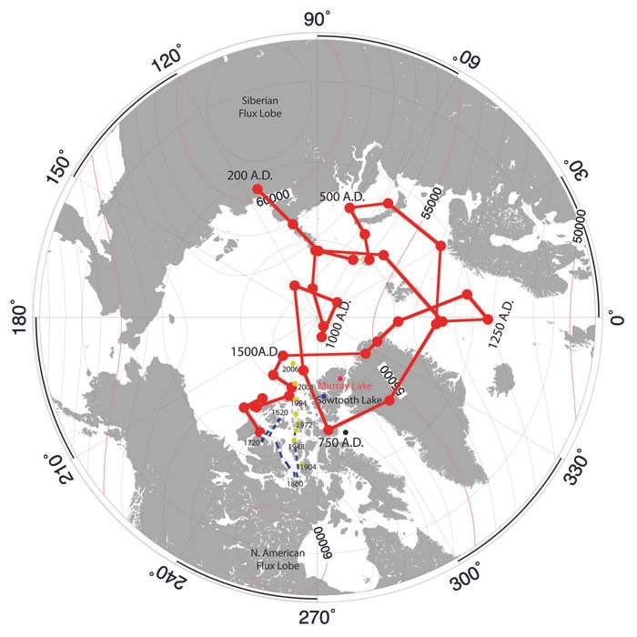
Researchgate.net Each dot represents a 50 yr. progression.
Is this correlation between climate change and pole movement just a coincidence or is it suggesting a real possibility ? “Analysis of the movement of the Earth's magnetic poles over the last 105 years demonstrates strong correlations between the position of the north magnetic, and geomagnetic poles, and both northern hemisphere and global temperatures. Although these correlations are surprising, a statistical analysis shows there is a less than one percent chance they are random …”
A.K. Kerton, 2009 : Climate Change and the Earth’s Magnetic Poles, A Possible Connection
While it is highly likely that the movement of earth’s magnetic poles are contributing to climate change, how is that possible since air is not attracted to magnetism? Recent research found that the movement of earth’s magnetic poles causes gravity waves which affect earth’s very high altitude magnetic radiation shield. That affects air currents in the earth’s upper atmosphere which in turn affect the stratosphere and troposphere, and ultimately our weather.
Solar radiation hitting earth’s magnetic radiation shield (not to scale).
Jing Liu, et al. Solar flare effects in the Earth's magnetosphere, Nature Physics (2021)

SUBDUCTION
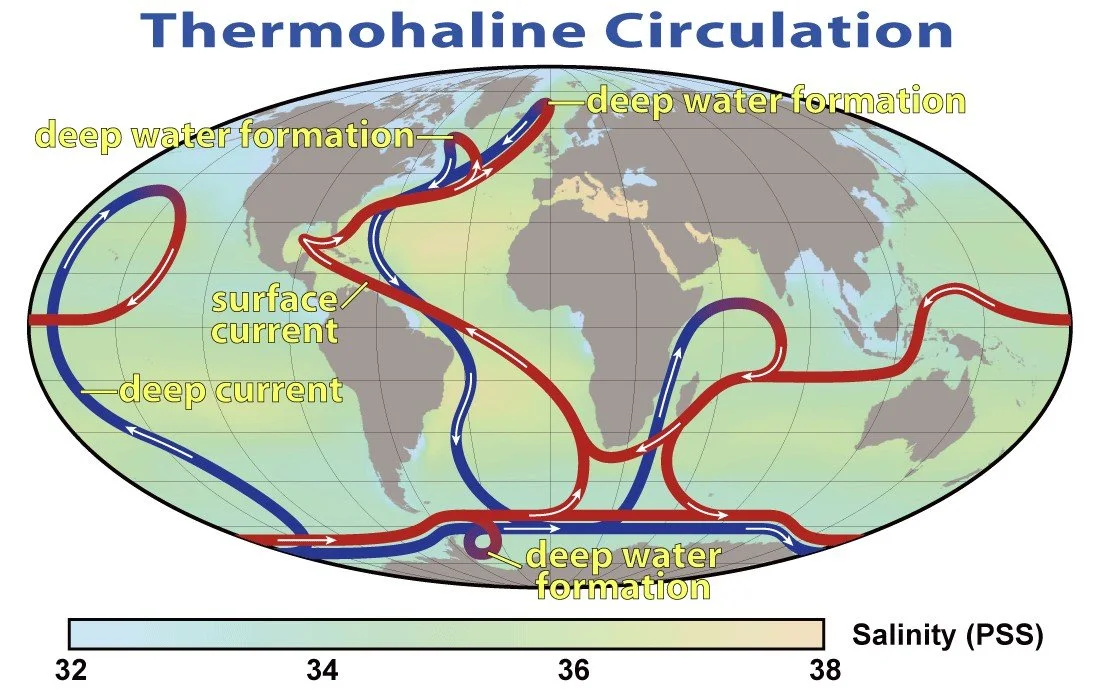
After warming Ireland, Britain and Northern Europe, the rapidly cooling and saline saturated Gulf Stream becomes denser than the North Atlantic ocean it slides over. At 75 degrees north latitude it begins to sink to the ocean floor as it enter the Arctic Ocean Basin and feeds into the global Thermohaline Circulation. There are six similar tropics to deep ocean currents. All of the currents absorb carbon dioxide as they cool. It will take 200 to 500 years before the sunken waters up well to the surface. Waters up welling now sank when atmospheric carbon dioxide was 280 ppm, 59% lower than today’s level creating a net carbon dioxide sink. Graph by NASA via Wikipedia, public domain.
THE SUN
Yet if everything currently known about climate change conspired to reach its maximum cold phase at the same time, it still wouldn’t be cold enough to explain the abrupt 1,200 year long plunge to the near ice age temperatures of the Younger Dryas (12,700 to 11,500 years ago). What caused that abrupt plunge and equally fast recovery? Could it happen again? The simplest explanation is the sun. We’ve always been told the sun’s strength doesn’t change. It might be time to rethink that. [The Lake Agassiz out pouring theory is uncertain.]
“The sun is the ultimate factor in causing change of the terrestrial climate. At a small but measurable level, the sun varies, just like most of the stars do.”
Dr. W. W. Soon, Astrophysics (Harvard), Climate Change : The Facts, chapter 4, page 57.
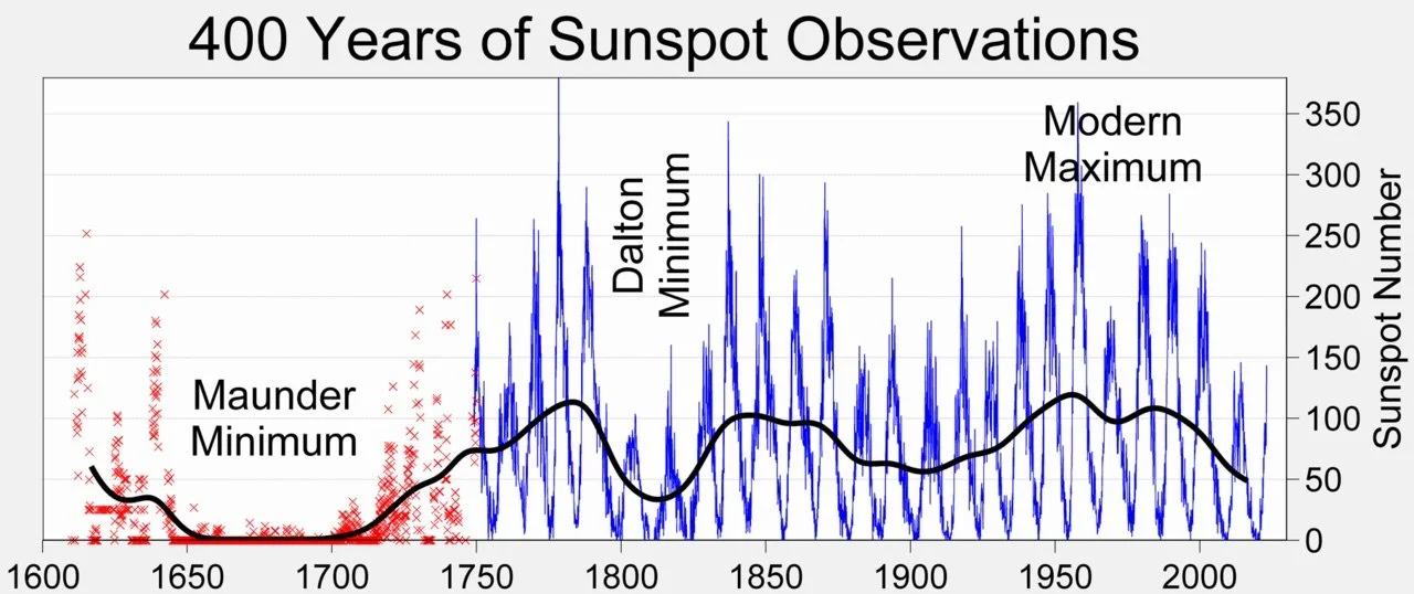
It’s been known for centuries that the sun’s north and south poles reverse like clockwork every eleven years. When they reverse there is a sharp rise in sun spot (solar storm) activity as shown in the march of the blue spikes. The black line shows the moving average number of sun spots. During the Maunder Minimum it flat-lined which coincided with the coldest part of the Little Ice Age. The Dalton Minimum also had significantly fewer sun spots and was the last cold phase of the Little Ice Age. Is the drop in temperature and sun spots a coincidence?
Maunder Minimum : Author Unknown
From a research paper by Dr. Schmutz: The correlation between the sun’s strength and temperature for 660 years indicates a 98% probability that the Little Ice Age was caused by variations in the sun’s strength. If the period is limited to 1650 to 1890, the probability increases to 99.99%. Schmutz WK To date there are five known solar cycles.
POPULATION
Missing in action from the climate change debate is the increase in global population. Graphs on the internet are scarce. Graph created by Gemini for this website.
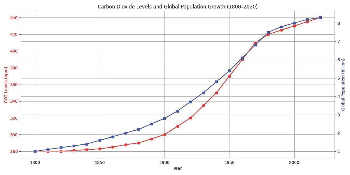
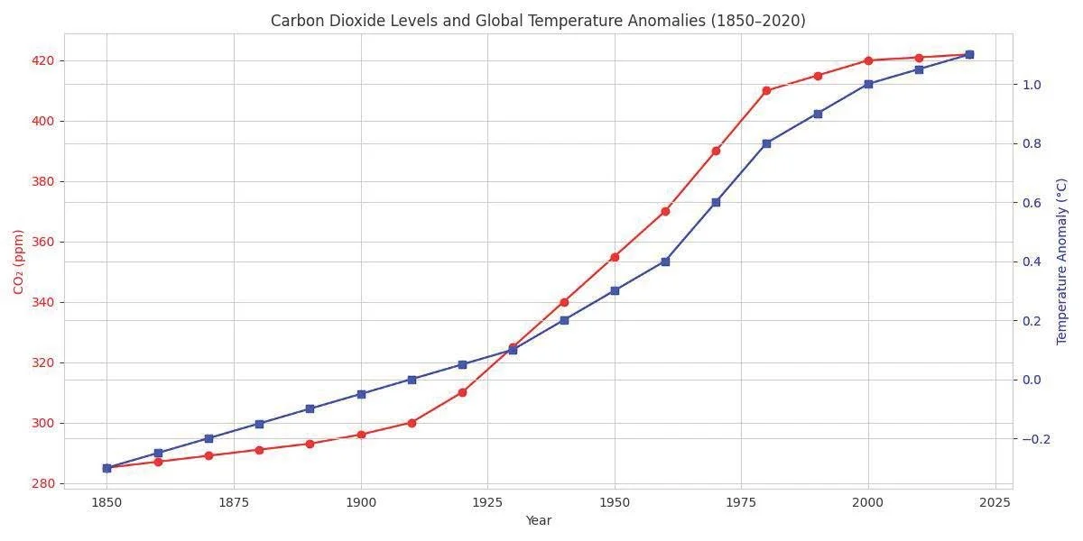
The upper graph shows a strong correlation between the carbon dioxide and population increase. The lower graph shows a strong correlation between carbon dioxide and global temperature.
Logic requires that those who believe the temperature-carbon dioxide graph is proof carbon dioxide causing climate change must also believe this temperature-population graph proves population growth is equally responsible for causing climate change. But as always, graphs show a correlation, a suggestion and never proof of anything.
The global population is expected to grow from 8 to 10 billion by 2050, a 25% increase. That suggests a 25% energy consumption increase. Most of that energy will result in heat being generated by everything the energy powers - cooking, heating, air conditioning, refrigeration, cold storage, transportation and many more. All of that secondary heat radiates until it either reaches equilibrium with its surroundings or heats the atmosphere as it radiates its way into space. The secondary heat generated by humanity is therefore likely to cause further global warming as the population increases - overwhelming whatever green conservation efforts achieve.
THE FUTURE
We have had 450 years of very slow climate change causing generation after generation to believe the climate doesn’t change. Now it appears to be changing. Research has led many climate scientists to believe that greenhouse gases (excluding water vapor) are neither the sole cause of climate change and nor the dominant cause. Some question whether greenhouse gases are even involved at all.
The forces of nature appear to be in a warming phase. The climate history of the last 10,000 years suggests the global average annual temperature will rise 1 C (1.8 F) to its long term average. Add the effect of unstoppable population increase to that. While millions of years of climate history climate history says that abrupt, extreme climate change is highly unlikely, humanity would do well to prepare for a warmer planet.
Email : climate.science.123@gmail.com